
Mineral Springs
brand & Marketing Collateral Design
vibes
Clean, minimal, approachable, fresh, modern
industry
Home, Real Estate, Construction
the project
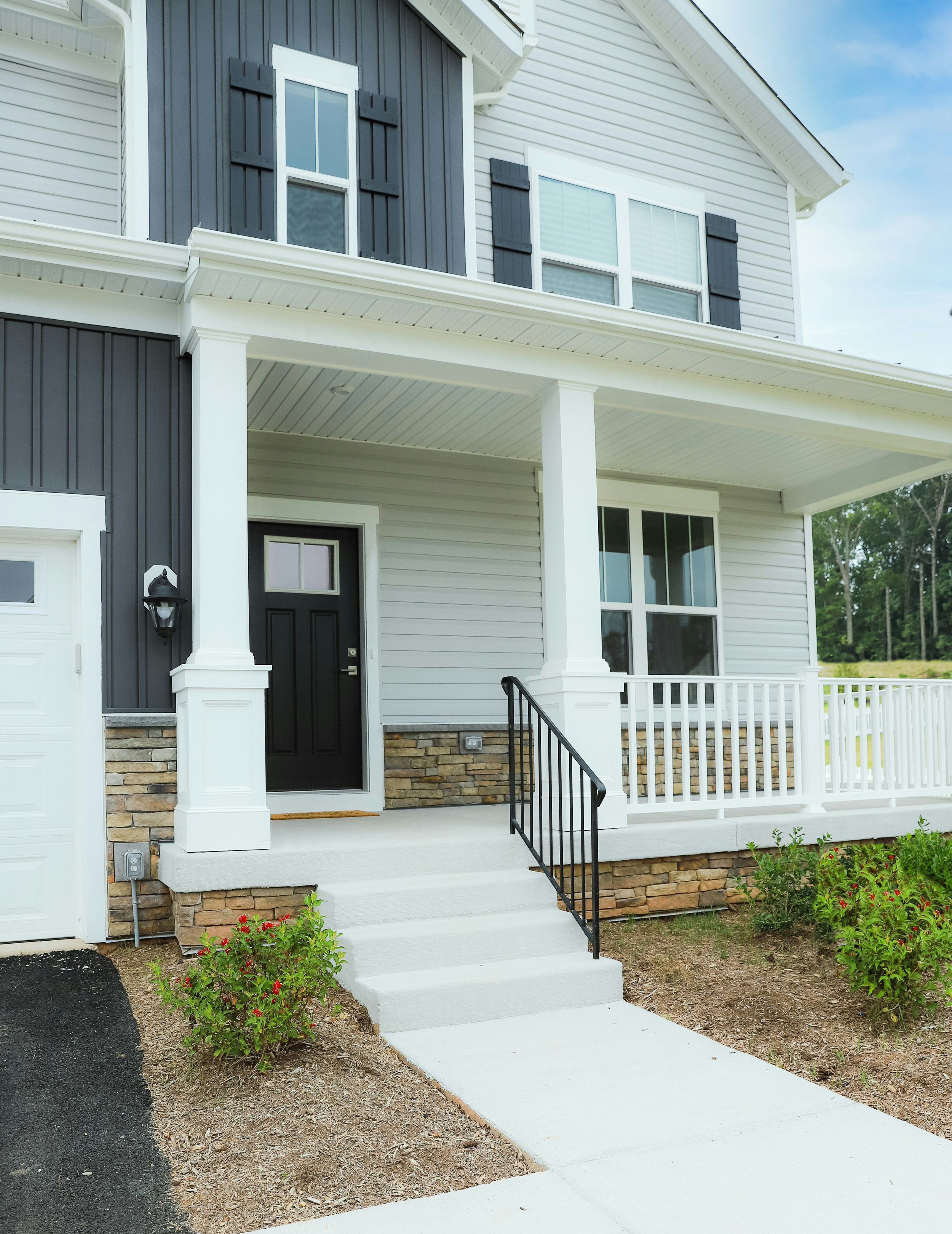
Had the absolute pleasure of working with Taylor and the team at McFarlane Field Associates again to bring the brand for Mineral Springs to life! This thoughtfully designed housing development coming to West Cumberland, Maine, is built on quality, simplicity, and a true sense of home.
To bring in those ideas, the brand and elements remain clean and minimal. In the logo mark, flowing water from the mountains reflect the spring concept, while the arch shape, inspired by a window, symbolizes a welcoming place, and a sense of home. The mountains can also be seen as an ‘M’ and the water as an ‘S’. The color palette is inspired by the natural tones of the home exteriors, creating a seamless connection between the brand and the community itself.
“ Working with Taylor was awesome! She is incredibly organized, attentive, and has an amazing ability to bring a vision to life. She nailed our goals for two separate projects and executed everything beautifully and on time. Her professionalism and efficiency made the entire process seamless. We will absolutely be working with her again—highly recommend!” Full review