
Slow Rise Farm
brand Design, packaging + merch design
Vibes
Rustic, playful, modern, organic, hand-drawn
Industry
Farm and Food
The Project
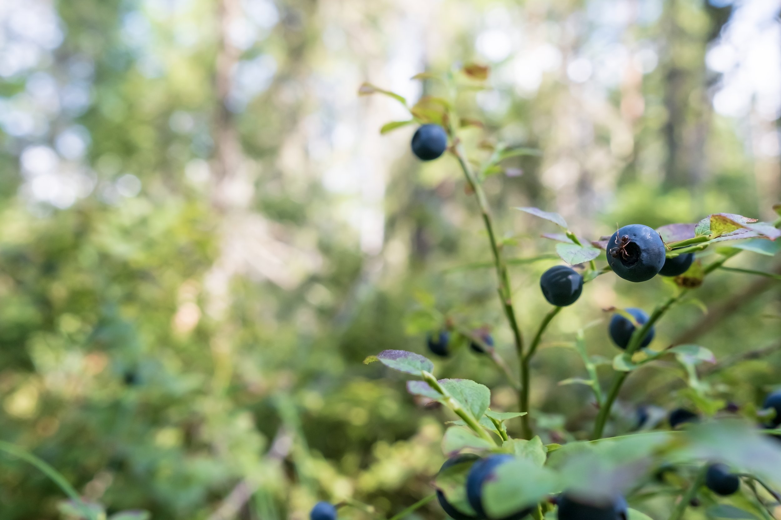
Kate originally came to me to refresh Slow Rise Farm’s packaging design for their fruit leather and to give the farm a recognizable brand. (Little did she know I had actually just bought some of the product at the Maine Wild Blueberry Festival!) The idea behind the logos and branding was to modernize the farm, while still keeping a playful vibe. The primary logo is based on the idea of the berries “rising up” the text with a hand-drawn blueberry graphic to give a rustic feel as well.
The packaging refresh played off that same idea. The flavors have corresponding hand-drawn elements as the background to make the flavor easily recognizable on the shelf. For the information, it is laid out in a clean format so that everything is clear and easy to understand. The packaging is now printed using a sustainable source(Roottree) which you can see by ordering the delicious fruit leather through Slow Rise Farm’s website!
“She helped our little home grown farm business upgrade to a more professional look, yet our branding still retained a feeling of whimsy and fun. I couldn't be more thankful!” Full Review
